Matte, Glossy, or Soft Touch: Which Business Card Finish is Right for Your Brand in Irvine?
If you’re handing out cards in Irvine — at a coffee meeting off Jamboree, a networking event at the Irvine Spectrum, or a pitch to a client in the business district — the finish on your card does more work than most people realize. Matte reads as understated and professional. Glossy pops with color and photographs. Soft touch feels like suede and signals premium. None of them is “best.” The right one depends on your industry, how your card gets handled, and what you want someone to feel in the two seconds before they read your name.
This guide breaks down how each finish actually behaves in the real world — durability, fingerprints, writing, cost, and who each one suits — so you can order with confidence instead of guessing.
The Three Finishes at a Glance
Before the details, here’s the short version. Most business card decisions come down to a trade-off between visual impact, tactile feel, and how the card survives daily use.
| Finish | Feel | Best For | Main Trade-off |
|---|---|---|---|
| Matte | Smooth, non-reflective, slightly paper-like | Consultants, attorneys, finance, anyone writing on cards | Colors look flatter; can scuff over time |
| Glossy | Slick, shiny, reflective | Photographers, restaurants, retail, bold branding | Fingerprints and glare; hard to write on |
| Soft Touch | Velvety, matte-suede texture | Designers, luxury services, creative studios | Higher cost; can show smudges from oily hands |
That table gets you 80% of the way there. The rest is about matching the finish to your brand’s personality and your actual use case.
Matte Finish: The Reliable Workhorse
Matte is the default for a reason. It’s a coated stock with a non-reflective surface, so light doesn’t bounce off it. Text stays readable under any lighting — important when someone’s glancing at your card in a dim restaurant or under harsh office fluorescents.
The biggest practical advantage: you can write on a matte card with a pen. If you’re the type who jots a follow-up note or a referral name on the back before handing a card over, matte is the only finish that cooperates. Gloss and soft touch both fight the ink.
Who matte suits
Professional services almost always look better in matte. Attorneys, accountants, financial advisors, insurance agents, and B2B consultants benefit from the restrained, no-nonsense impression. A matte card says “I’m here to do business,” not “look at my logo.”
Matte also handles large blocks of text well. If your card has a tagline, a list of services, or a QR code with instructions, matte keeps it legible. Gloss would create glare that makes people tilt the card to read it — never what you want.
Where matte falls short
Color vibrancy is the trade-off. Deep blacks and saturated colors look slightly muted compared to gloss. If your brand relies on a vivid palette — a bright orange, an electric blue — matte will soften it. And on cheaper matte stocks, the surface can scuff or show wear at the corners after a few months in a wallet. A heavier cardstock (16pt or 18pt) solves most of that.
Glossy Finish: Maximum Color Impact
Gloss is a coated finish with a reflective sheen. It makes colors look richer and photographs look sharper — which is why it’s the standard for postcards and marketing collateral where an image needs to grab attention.
On a business card, gloss works when your brand is visual. Photographers, videographers, graphic designers, restaurant owners, and retail shops often choose gloss because it makes their work look its best. If your card features a photo, a detailed logo, or a bold color block, gloss will render it with more punch than matte.
Who gloss suits
Anyone whose card is essentially a mini portfolio. A wedding photographer’s card with a sample image, a chef’s card with a plated dish, a boutique’s card with a product shot — these benefit from the reflective surface. Gloss also tends to be the most affordable option, since it’s a standard coating applied during printing.
Where gloss falls short
Two real problems. First, fingerprints. A glossy card shows every smudge, and after a few handoffs it can look grimy. Second, glare. Under direct light, the surface reflects and obscures whatever’s printed on it. You can’t write on gloss with a normal pen — the ink beads up and smears.
There’s also a perception issue. Gloss can read as “mass-produced” or “budget” to some audiences, especially in creative and luxury fields. If your brand positioning is premium, gloss may undercut it.
Soft Touch Finish: The Premium Feel
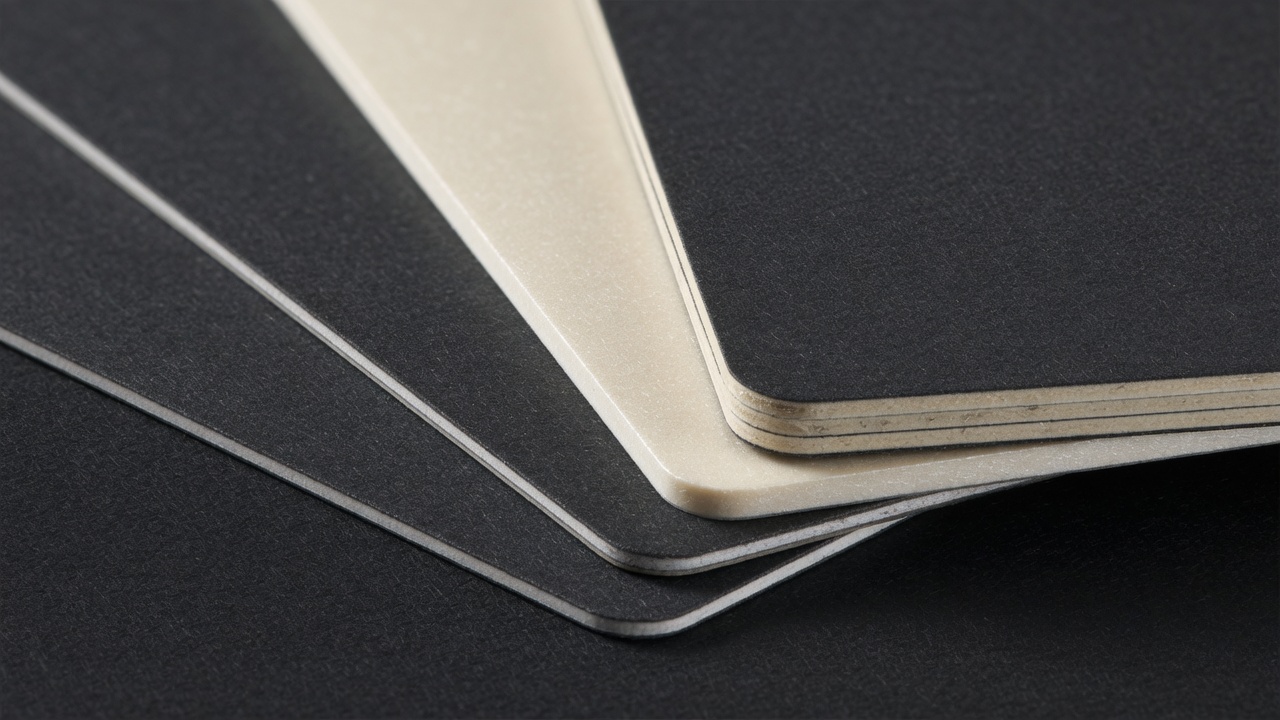
Soft touch — sometimes called velvet or suede laminate — is a matte laminate with a textured coating that feels like the surface of a peach. It’s the finish people comment on. When someone receives a soft touch card, they usually run their thumb across it before they read it.
That tactile response is the whole point. Soft touch creates a memorable physical impression, which matters in a stack of fifty cards collected at an event. It signals that you invested in your brand.
Who soft touch suits
Designers, architects, luxury real estate agents, high-end salons, boutique law firms, and creative studios. It pairs especially well with minimal design — a lot of white space, a single strong logo, and a spot of foil or embossing. The texture does the talking, so the design doesn’t need to shout.
Where soft touch falls short
Cost is the main one. Soft touch laminate adds a step and a material, so it’s typically the most expensive of the three. It also shows oily fingerprints more than you’d expect — the texture catches skin oils, and once a smudge sets in, it’s hard to wipe off without leaving a mark. And like gloss, it’s not writable.
One more thing: soft touch looks best on a heavier stock. On a thin card, the texture feels like a coating rather than a material, and the effect falls flat. Pair it with 16pt or heavier.
How to Match Finish to Your Brand
Forget the finish for a second and answer three questions about your brand.
- What’s your industry’s default? If every attorney in Irvine hands out matte cards, a glossy card makes you look like an outlier — which can be good or bad depending on your positioning.
- What’s on the card? Photographs and bold color blocks favor gloss. Text-heavy layouts and QR codes favor matte. Minimal designs with strong branding favor soft touch.
- How will people use it? If you expect clients to write notes on your card, matte is your only real option. If the card is a keepsake or a portfolio piece, soft touch earns its cost.
A quick rule of thumb: matte for trust, gloss for visibility, soft touch for status.
Cost Factors That Actually Move the Price
Finish is only one line item. When you get a quote, these are the variables that change the number most:
- Quantity. The single biggest lever. Going from 500 to 1,000 cards often costs only slightly more per unit because setup is spread across more pieces.
- Cardstock weight. 14pt, 16pt, and 18pt are the common tiers. Heavier stock costs more but lasts longer and feels better in hand.
- Finish type. Gloss is usually cheapest, matte is mid-range, soft touch is the premium option.
- Add-ons. Foil stamping, spot UV, embossing, and edge painting each add cost and often require a separate pass.
- Turnaround. Rush jobs cost more. Standard turnaround is where you save.
If you’re ordering for a team, ask about pricing at 500, 1,000, and 2,500 units. The per-card cost drops fast, and it’s often worth ordering more than you think you need.
Common Mistakes to Avoid
Most bad business cards fail for predictable reasons. Here’s what to watch for.
- Choosing gloss for a text-heavy card. Glare makes people work to read it. If your card has more than a few lines, go matte.
- Using soft touch on thin stock. The texture needs weight behind it or it feels cheap.
- Ignoring how the card ages. Gloss and soft touch both show fingerprints. If your card lives in a pocket or gets handled constantly, matte holds up better.
- Skipping the proof. Colors shift between screen and press. Always approve a physical proof or a calibrated digital proof before the full run.
- Mismatching finish to brand. A luxury brand on glossy stock, or a playful brand on soft touch, sends a mixed signal.
The fix for most of these is simple: order a small sample set in each finish before committing to a full run. Holding the card in your hand answers questions a screen can’t.
Getting Business Cards Printed in Irvine
Local printing matters more than people expect for business cards. You can walk in, feel the actual stocks, compare finishes side by side, and catch color issues before a full run. For Irvine businesses, that’s a real advantage over ordering blind from a national site and hoping the matte looks like the matte on your monitor.
When you’re ready to order, bring three things: your final artwork (with bleed and crop marks), your target quantity, and a rough idea of your budget. A good print shop will steer you toward the finish that fits your brand and your use case rather than upselling you into the most expensive option. If you’re weighing finishes for a larger collateral package — brochures, folders, direct mail — it pays to keep them consistent so your brand reads the same across every piece.
For businesses in and around Irvine, working with a local printer who handles digital and offset work in-house means faster proofs, fewer surprises, and a card that matches what you approved. You can see the full range of card stocks and finishing options at Main Graphics, and if you’re planning a broader campaign, they handle brochures, banners, and direct mail under the same roof.
FAQ: Business Card Finishes
Can I combine finishes on one card?
Yes, and it’s a common technique. Spot UV over a matte or soft touch base gives you a glossy raised element against a non-reflective background — a logo, a pattern, or a signature line. It creates contrast without making the whole card glossy. It does add cost and a production step, so it’s usually reserved for premium cards.
Which finish is most durable?
Matte generally holds up best over time because it doesn’t show fingerprints or smudges the way gloss and soft touch do. Heavier cardstock (16pt and up) matters more than finish for overall durability, though. A 16pt matte card will outlast a 14pt soft touch card in daily wallet use.
Does finish affect how long printing takes?
Usually not much. Standard matte and gloss are applied during the print run. Soft touch laminate and add-ons like foil or spot UV add a finishing pass, which can extend turnaround by a day or two. If you’re on a tight deadline, ask about turnaround time before you choose the finish, not after.
Making the Call
Pick matte if your brand is professional, text-heavy, or you want clients to write on your card. Pick gloss if your card is visual and color needs to pop. Pick soft touch if your brand is premium and the tactile impression is worth the extra cost. If you’re still unsure, order a sample of each in your actual artwork — the right finish usually becomes obvious the moment you hold it.
Visit Main Graphics | Commercial Printer, Brochures, Banners, Business Cards, Poster Print Shop